B2B Industrial UX · Interaction Design · UI Design
B2B Industrial UX · Interaction Design · UI Design
A full interaction concept and UI redesign for the control systems of industrial mixing machines used in paint, lacquer, and cosmetics manufacturing. A real client, a real factory floor, and a brief that required understanding how machines actually work before designing how they should be operated.
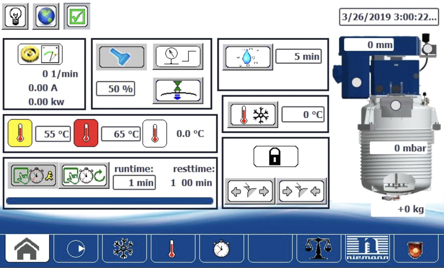
The existing machine interfaces looked like a toolbox: every function visible at once, no sequence, no hierarchy. Operators had to already know what they were doing to use them.
Niemann's Kreis-Dissolver machines are industrial mixing and dispersing systems used in the production of paints, lacquers, pharmaceuticals, and cosmetics. They are precise, high-powered, and potentially dangerous if operated incorrectly. The existing control UI reflected the mechanical complexity of the machines rather than the goals of the people operating them.
Functions were arranged in a bottom tab bar with no implied sequence. Icons were inconsistent, many of them non-standard pictographs that required prior training to interpret. Colour was used to flag warnings but also for neutral status indicators, so the visual weight of the interface was permanently noisy. Operators had to carry a mental model of the machine's mechanical dependencies just to decide what to press next. Customer feedback documented recurring operation errors and misunderstandings even from trained staff.
The operating context made this harder, not easier. Users work in large factory halls, often wearing gloves, under suboptimal lighting, on explosion-protected touchscreens with limited sensitivity. An interface that required precision, careful reading, or prior knowledge of machine internals was not just frustrating: it was a liability.

75+
Years of machines
Niemann has been building mixing machines since 1963. The UI had not kept pace with the mechanical sophistication the company was known for.
Global
Operator base
An international user base meant the redesign had to work across languages and literacy levels. Visual communication had to carry more weight than text.
0 errors
The design goal
The system had to be operable without prior knowledge of the machine's mechanical internals. A user who follows the interface should not be able to make a critical mistake.
Six months, five students, one real client. The first half was entirely about understanding the machines. The second half was about making them disappear.
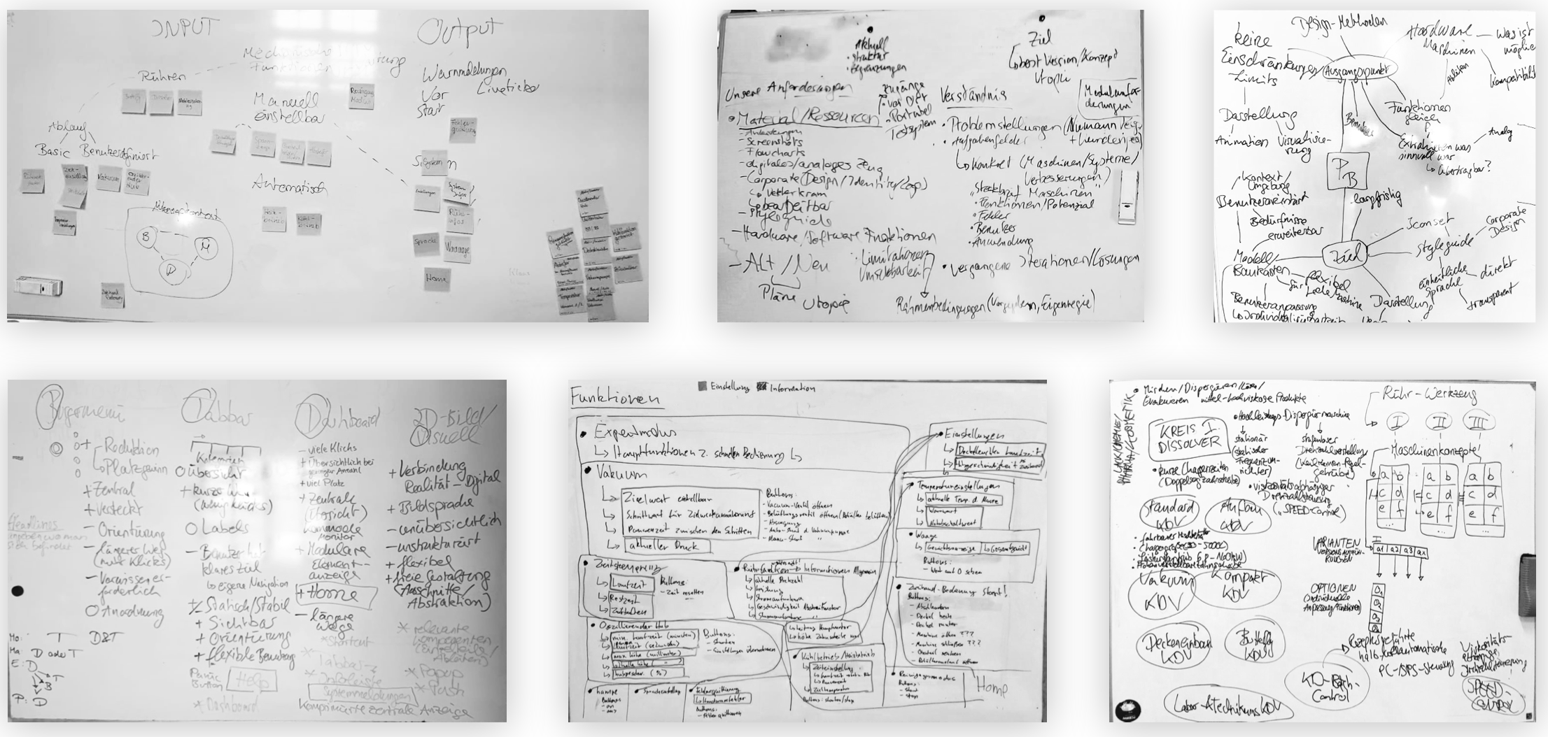
The project began with a site visit to the Niemann factory in Melle: a guided tour of the production floor, conversations with engineers and machine operators, and hands-on time with the existing control interface. The goal was not to collect requirements in a structured way but to develop enough mechanical understanding that design decisions could be grounded in how the machines actually worked, not just how they were described.
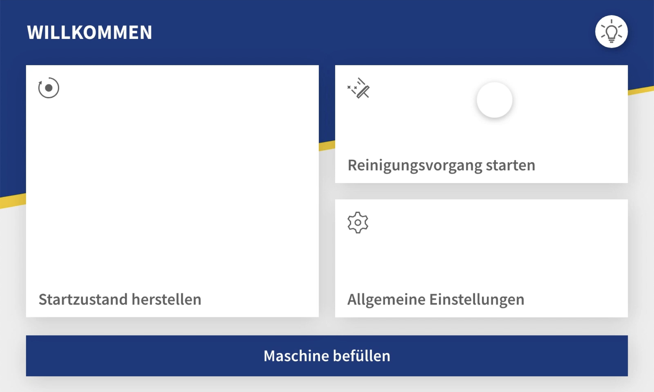
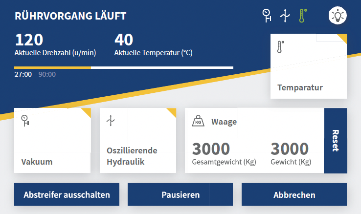
The concept phase used card sorting, brainstorming, personas, user stories, and the six hats method across multiple weeks of whiteboard sessions. The central insight that shaped everything was the idea of a chronological navigation structure: instead of presenting all functions simultaneously, the interface would guide the operator through the production process step by step, from filling to mixing to product extraction. The operator's goal, not the machine's architecture, would determine the sequence.
A "Default state" concept was introduced early: a single button that resets the machine to a known starting position, eliminating the need for operators to mentally track machine state before beginning a new batch. Shortcuts for recurring sequences automated routine steps. The interface would handle the machine's internal complexity; the operator would only see what they needed at each moment.
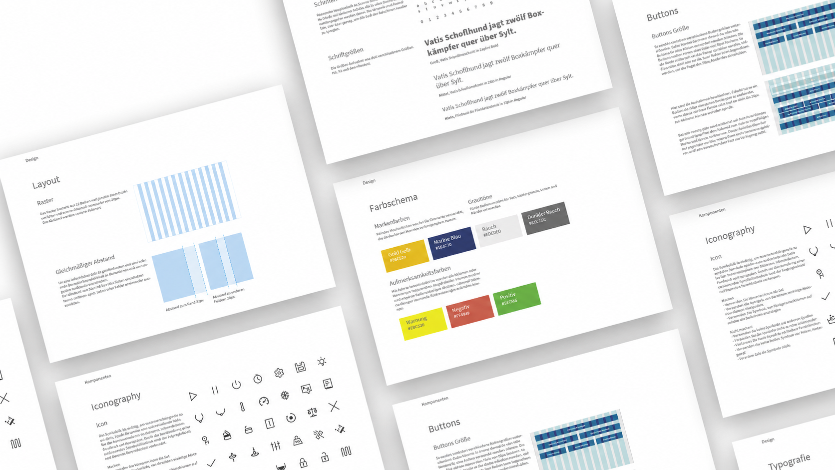
Wireframes were built in Adobe XD and presented directly to the Niemann team at their development lab for feedback. Two rounds of iteration refined the structure before visual design began. The colour palette extended Niemann's existing corporate identity directly: the navy blue and white from their brand materials, grey for secondary elements, and gold as an accent colour visible in the company's own communications. Nothing was invented; everything was derived. The typeface is Source Sans Pro, chosen for legibility across all display sizes. Large touch-friendly tiles use drop shadows to signal interactability, designed specifically for gloved operation and suboptimal factory lighting.
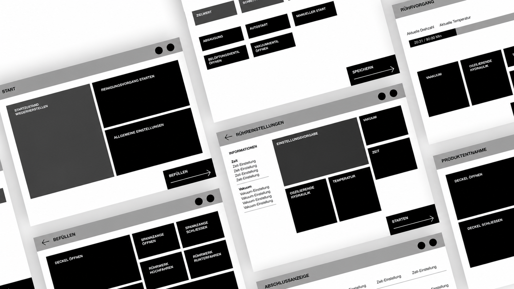
The project divided into two parallel tracks in the final phase. Projekt A covered the UI for the current explosion-protected display hardware: constrained dimensions, limited touch sensitivity, and a need for maximum clarity under factory conditions. Projekt B extended the concept for a next-generation display with animation support, built in InVision Studio, showing transitions and loading states that communicated system progress without adding cognitive load.
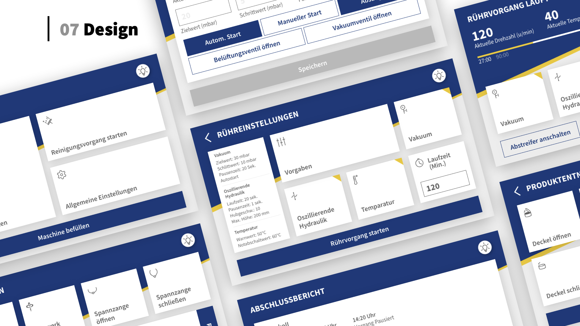
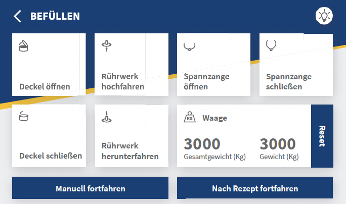
The iconset was designed from scratch for the Niemann context. Generic icons from existing libraries did not match the machine's physical components or the operator's mental model. Each icon was derived from the mechanical reality of the machine: the shape of the mixer arm, the clamp mechanism, the lid, the weight sensor. The design language is minimal and stroke-based, sized for gloved-hand operation.
The styleguide defined the full design system: colour palette, typographic scale, spacing rules, grid, button sizes, and iconography guidelines. The intention was that any future Niemann machine variant could be designed to the same standard, making the styleguide a foundation for a wider design system rather than documentation of a single project.
A complete interaction concept, validated with the client across multiple sessions at their development lab. The result covered UI design, a custom iconset, a full styleguide, and an animated prototype for the next-generation display.
The final deliverables were presented to the Niemann team in June 2019. The redesign was received positively at each feedback stage, with the client indicating the concept addressed the recurring usability problems their customers had reported. The chronological navigation structure, the Default state concept, and the custom iconset were all validated through direct testing at the machine.
The project was also exhibited in the Interaction Design Lab's project gallery at Hochschule Osnabrück, and is documented on the university's research pages as a cooperation project between the Media and Interaction Design programme and Wilhelm Niemann GmbH & Co. View on hs-osnabrueck.de
Chronological
Navigation structure
The core concept: the interface follows the operator's production workflow from start to finish, not the machine's internal architecture. Users move forward through a process, not sideways through function categories.
One button
Default state reset
A single action returns the machine to a known starting position. Operators do not need to mentally track machine state between batches. The interface absorbs that complexity.
Custom
Iconset from scratch
No generic icon library fit the machine context. Every icon was derived from the physical components and mechanical actions of the machine, sized for gloved operation.
Scalable
Design system, not a one-off
The styleguide was written as the foundation for a cross-machine design system. The same visual language, grid, and iconset could be extended to all current and future Niemann machine variants.
1.0
Best possible grade
German grading scale, equivalent to a 10 on the Dutch scale. Awarded for the full project across concept, design, and delivery.
Three things this project reflects about how I work:
Domain first
You cannot design what you do not understand
The project spent weeks on mechanical analysis before touching a design tool. Understanding the sequence of a mixing cycle, what the clamp does, why the default state matters: that was not background research, it was the design. Every structural decision in the interface followed directly from understanding how the machine physically worked and what the operator was actually trying to do.
Real clients
Client feedback is a design input, not a checkpoint
Working with a real client across multiple sessions at their own facility changed the rhythm of the project. Feedback fed into the next iteration rather than closing a phase. Niemann's engineers knew things about their machines that no desk research would have surfaced, and the design was better for that exchange.
Systems thinking
A styleguide is a design decision, not documentation
Writing a styleguide intended to extend across the entire Niemann machine range required thinking past the single screen in front of us. Every spacing rule, every icon specification, every colour decision had to hold for contexts we had not yet designed. That discipline, designing for reuse rather than for the current task, is the difference between a project and a system.