Connected Product Design · Interaction Design · Physical Prototyping
Connected Product Design · Interaction Design · Physical Prototyping
A smart cup that measures fluid intake in real time and sends the data to a companion app for care staff. Built from scratch: 3D-printed housing, load cell sensor, ESP8266, Firebase backend, and a full Ionic app. One semester, two students.
Elderly residents often do not know they are underdrinking. Carers often do not have time to check. The system had to solve both problems without asking either person to do anything differently.
Elderly people have a reduced thirst sensation. They may feel completely fine while being dehydrated, which means they are not avoiding drinking out of stubbornness or forgetfulness alone: they genuinely may not register that they need to. Add to that the avoidance behaviours that do exist, drinking less to reduce toilet trips, difficulty swallowing, the disruption of routines, and you have a situation where underdrinking is invisible from the inside and hard to catch from the outside.
Care staff in residential settings are responsible for many residents at once. Short-staffing in elderly care is not an exception, it is the norm. A carer cannot be physically present with every patient throughout the day, and manual drinking logs, where they exist at all, are inconsistently kept. By the time symptoms appear, confusion, dizziness, urinary infections, the problem has been building for hours. The monitoring gap is not a failure of care, it is a structural constraint that no individual carer can solve alone.
The design challenge was to bridge that gap without adding work to either side. The cup had to work for a 75+ user with no patience for technology, no margin for error, and potentially reduced grip strength. The app had to give a carer a real-time overview of multiple patients in the seconds between tasks. One connected system, two completely different users, zero shared interface, and no manual input required from either.
75+
Target user age
Design constraints included swollen fingers, reduced grip strength, limited screen literacy, and lower tolerance for error messages.
2 users
One service, two sides
The senior using the cup and the carer monitoring the app. Both needed the system to work without the other's involvement.
0 steps
Manual input required
The cup logs intake automatically. Neither the resident nor the carer has to enter anything for the data to appear.
Two parallel workstreams: a 3D-printed, Arduino-powered physical prototype and a full Ionic app backed by Firebase. Both had to speak to each other by the end of the semester.
The project started with a different brief. Our first concept was an incontinence-tracking service that would help seniors predict toilet timing based on fluid intake. We spent several weeks on it before acknowledging a fundamental problem: too many variables, none of them measurable with the precision the concept required. We kept the cup, pivoted the purpose, and ended up with something more tractable and more broadly useful.
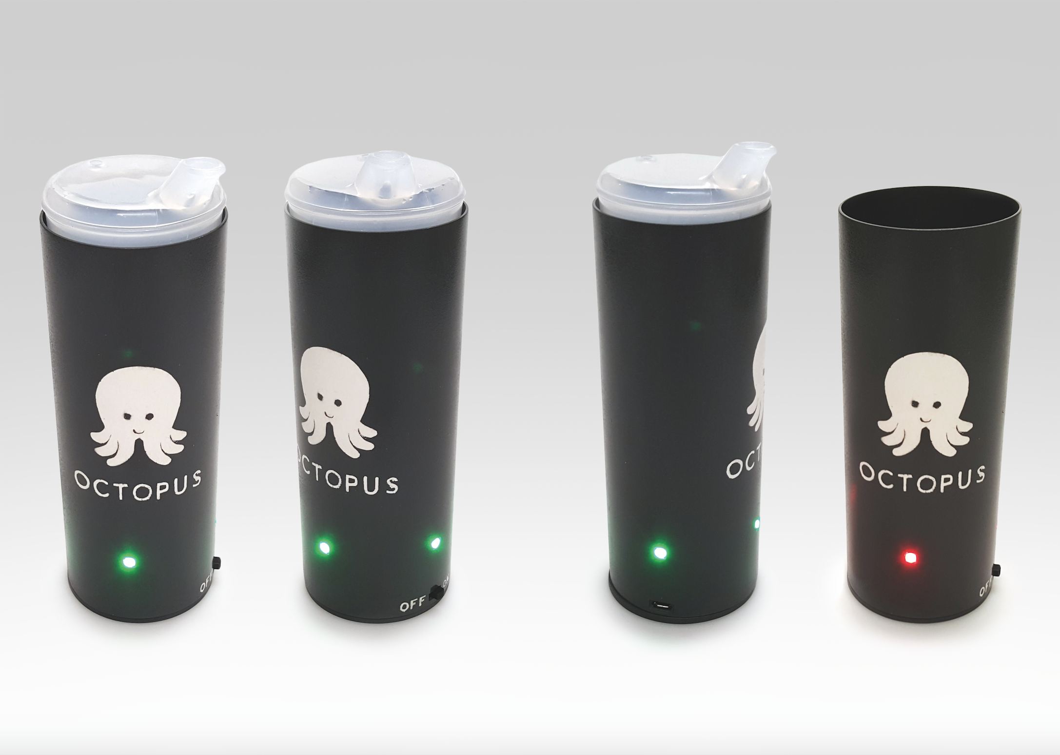
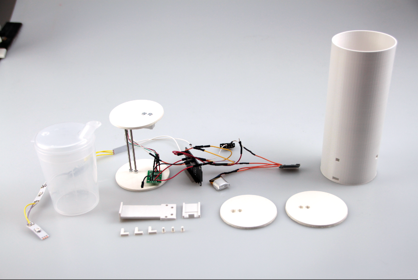
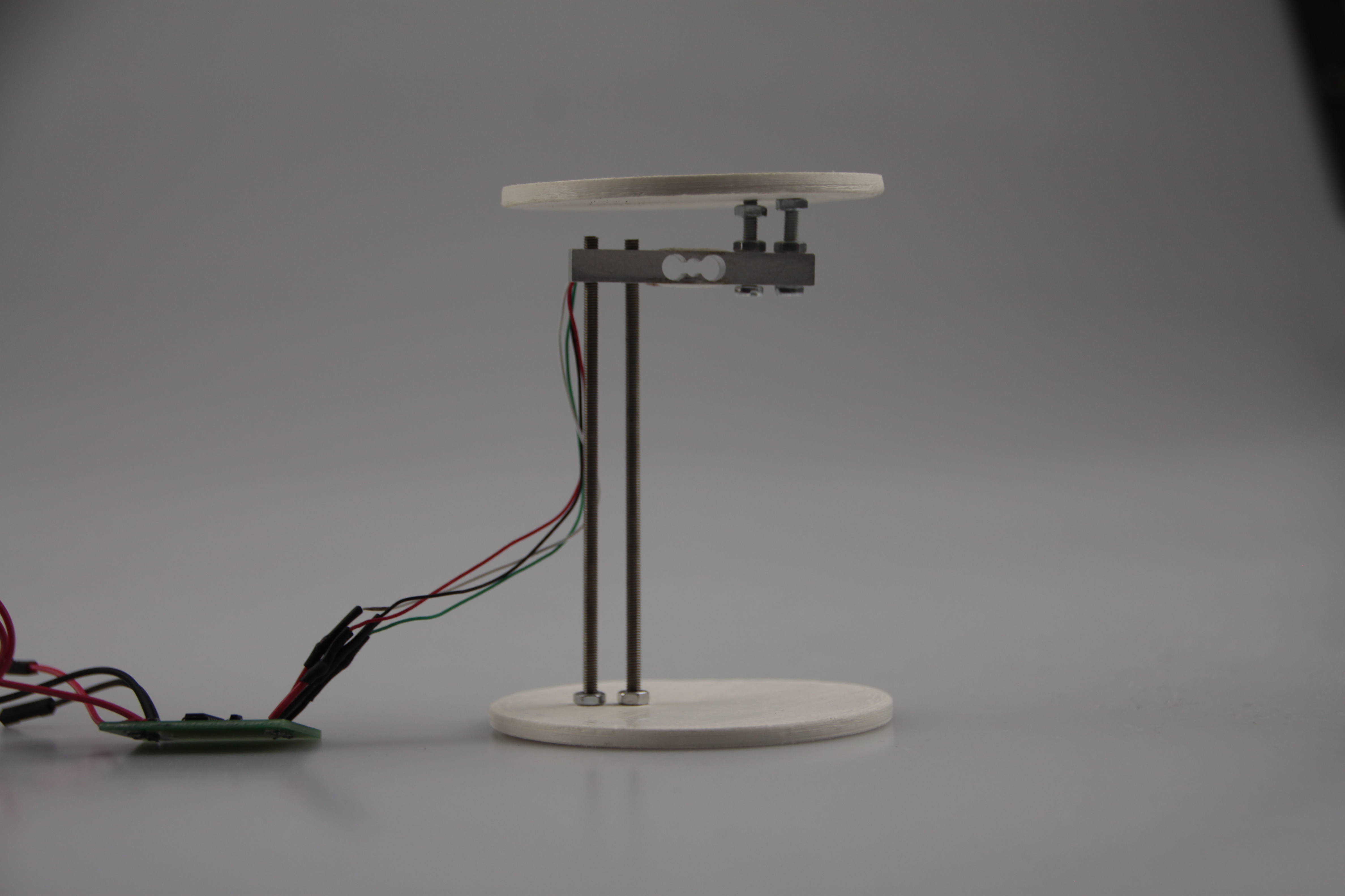
The physical prototype was designed in Fusion 360 and printed on an Ultimaker 2+. The outer cylinder was designed to hold an existing drinking cup (a transparent beaker for seniors) dropped in from the top. Inside the base: a load cell sensor connected to an HX711 amplifier, an ESP8266 microcontroller with WiFi, a small LiPo battery, a slide switch, a micro-USB charging port, and a strip of four RGB LEDs positioned in the lower quarter. Everything had to fit within a 75mm diameter cylinder with 1.5mm walls.
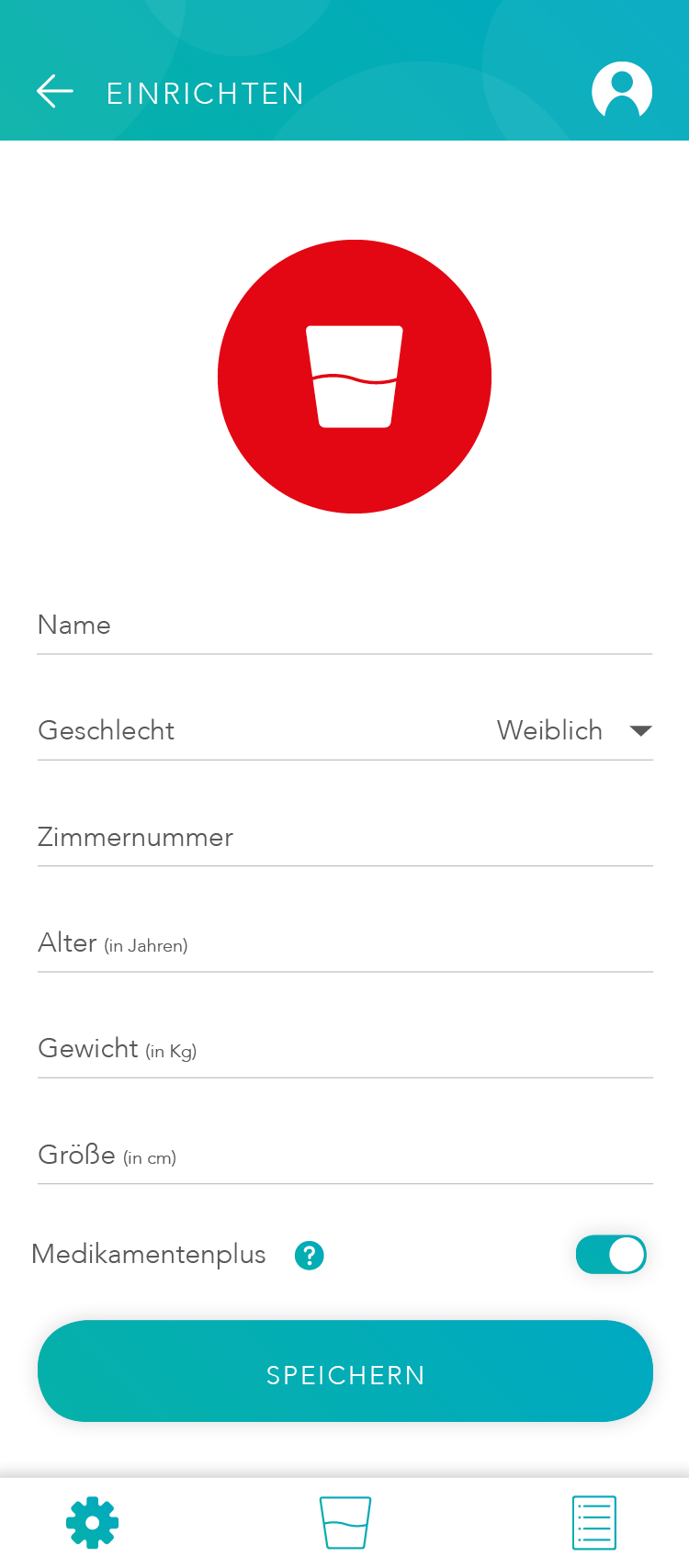
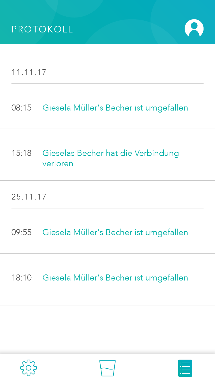
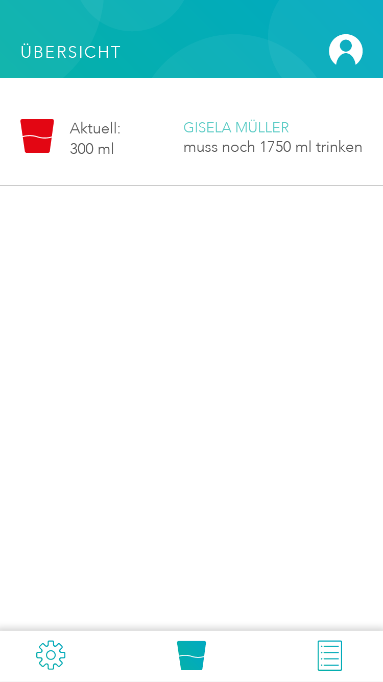
The app was built in Ionic with a Firebase backend. It has three tab pages: Manage (add, remove, and monitor connected cups), Overview (real-time intake status per patient), and Log (timestamped activity feed showing events like cup removed, connection lost). A fourth flow handles authentication and onboarding for new carers.
One usability decision we were deliberate about: the app calculates each patient's individual fluid target automatically based on weight, height, age, and sex. Carers enter the patient profile once. After that, the app tells them not just how much someone has drunk, but how much they still need to drink today, without requiring the carer to know or remember any target numbers.
One detail worth noting: a toggle called Medikamentenplus, which adjusts the daily fluid target upward for patients taking diuretic medication. It is a small feature but it reflects a real clinical edge case that care staff deal with regularly, and it only became part of the design because we asked the right questions early.
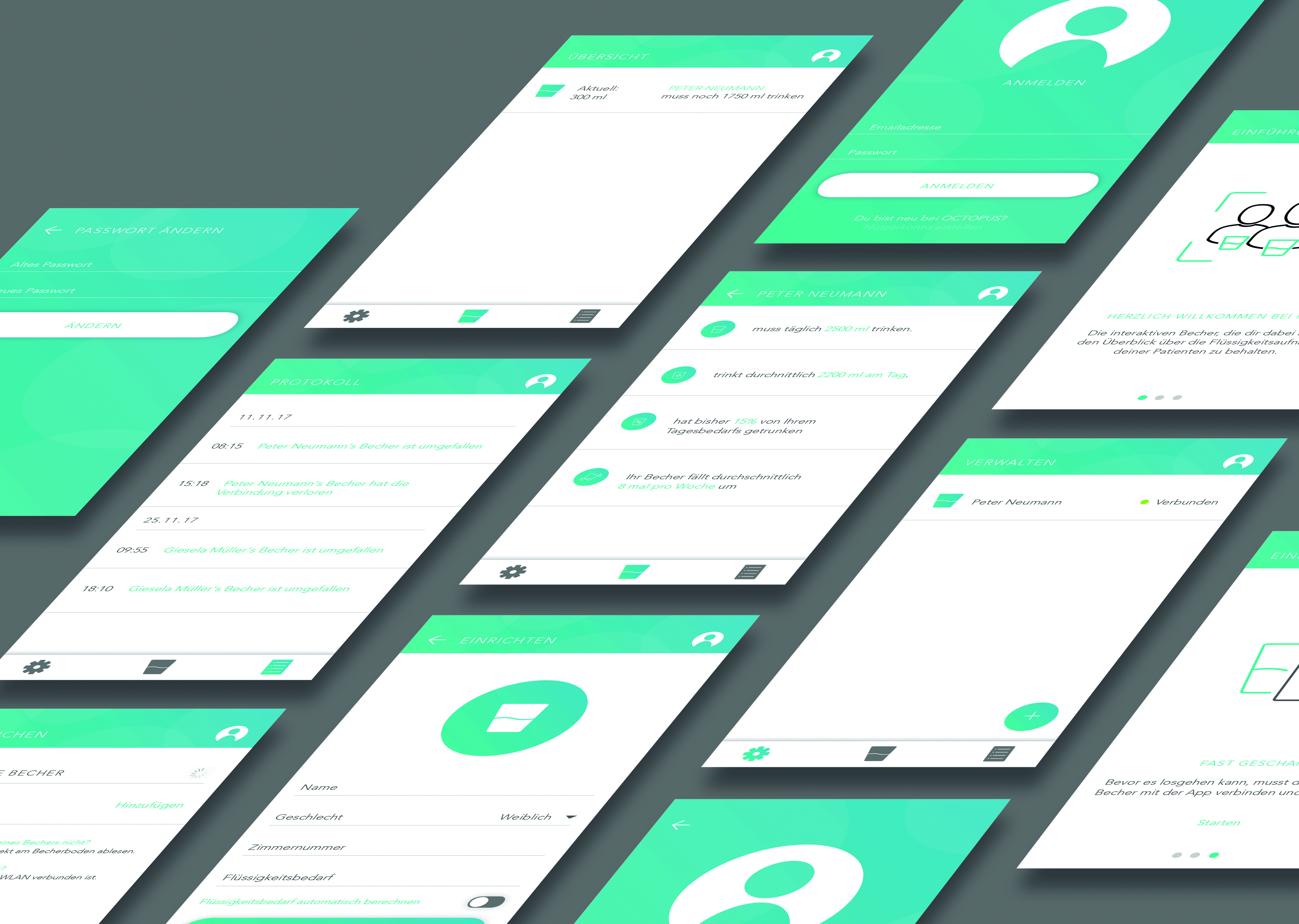
A working prototype: the cup measures, the app displays, the two talk to each other. Tested with peers in role-play scenarios, not real care home users, but functional end to end.
By the end of the semester the system worked as intended. Place a cup with liquid in the holder and the app updates within seconds. Remove the cup and the LED turns red. The activity log timestamps both events. Authentication, patient profiles, and the Medikamentenplus toggle all function correctly.
We did not test with real seniors or care staff. Recruiting a 75+ population within an academic ethics framework, in one semester, was not feasible. Instead we ran role-play sessions with fellow students acting as carers, focusing on the app usability and the clarity of the LED feedback. The sessions surfaced a few interaction issues we iterated on, but the honest caveat is that the real-world usability questions remain open.
End to end
Sensor to screen
Weight data from the load cell travels through the ESP8266 to Firebase and appears in the app within seconds. No intermediate step, no manual input.
3 states
Physical communication
The LEDs communicate cup absent, cup empty, and cup with liquid. Readable from any angle, at a glance, without the app. Designed for a ward environment where carers are moving and multitasking.
Automated
Fluid target calculation
Daily targets are calculated from patient profile data, adjusted for medication where relevant. Carers see how much is still needed today, not a raw number they have to interpret.
One pivot
Concept started elsewhere
The original concept was incontinence tracking. We abandoned it when we realised the variables were unmeasurable. The pivot to hydration monitoring was the right call, and the project was stronger for it.
Three things this project reflects about how I work:
Constraint as direction
Constraint as creative direction
Designing for users with limited digital literacy, reduced grip strength, and low tolerance for error meant stripping everything back to what was strictly necessary. No feature survived unless it was immediately understandable without explanation. That discipline produced tighter design decisions than any brief we could have written for ourselves.
End to end
End to end is a different kind of challenge
Taking a concept from sketch to working physical prototype to functioning app in one semester taught us where the real friction lives. Not in the ideas, but in the gap between the idea and the thing that actually works: a charging port that fits through a 1.5mm wall, a Firebase state that needs to trigger a log entry without overwriting the previous one, a LED strip that has to be readable from every angle without blinding anyone. The interesting problems were all in that gap.
Tone is design
Emotional and rational design are not opposites
The brief asked us to balance rational and emotional functions. The OCTOPUS name, the character, the rounded design language, the friendly onboarding copy: none of it is decoration. It is a deliberate decision to make a product doing a clinical job feel like it belongs in someone's room, not a hospital ward. That tension between warmth and precision was the most interesting design problem on the page.